LARGE PRINT BOOKS – HOW TO DRIVE MORE SALES

There are a number of print formats that authors can consider. The obvious choice is paperbacks but let’s not forget hardbacks and large print books. In this article, we’ll be looking at how you can make more money from large print versions.
With e-books, it’s fairly simple to increase the size of the font and do any number of things such is the technology but with print-on-demand it requires a new format.
There's a Market for Large Print Books
Top selling author and creative influencer, Joanna Penn’s co-written book Love, Second Time Around sold really well in the first year in Large Print – 52% ebook, 12% Print, 36% Large Print. Over a third of readers opted for the Large Print version!
Large Print appeals to:
Seniors who are visually impaired but prefer Large Print to audiobooks
The dyslexic who find it harder to read standard book fonts
People, who after a hard day’s work in front of a computer screen, find some solace in Large Print to prevent excessive eye strain
Those reading on public transport where all the constant motion can make it difficult reading smaller print
Why wouldn’t you be interested in earning more money by investing in a Large Print format?
My strategy at the moment is to sell e-books and print versions (paperback, hardback and large print) on KDP (Amazon) and paperbacks at Ingram Spark whose distribution network includes 39,000 stores (bricks and mortar, and online) worldwide and also libraries. In the not too distant future, I want to upload hardbacks and large prints to Ingram Spark as well. If only there were 48 hours in a day!
How Do I Prepare a Book for the Large Print Market?
There are a number of points to take into account when creating Large Print books:
Margins, Trim and Font Size
A 16 point font size is considered a minimum but 18 point is preferable. Remember that no font size in the whole document should be less than 18. This includes the copyright page, page numbers/headers and back cover blurb.
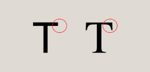
Use a sans-serif font like Tahoma or Verdana which is easier to read than a serif. You’ll notice from the diagram below that the sans-serif font has no embellishments.
Margins should be 1″ at the top, bottom and both sides. This will mean increasing the trim size (or physical size of the book) to accommodate more pages without it being unwieldy for the reader.

Text and Line Spacing
Use bold to accentuate text rather than italics or underlining and use black coloured text only.
Bulleted items should be double-spaced.
Do not use first line indentation which makes it difficult for visually impaired readers, and line spacing needs to be set at 1.5 or even higher.
Titles, Headings and Justification
Titles and headings need to have larger font sizes than your text. Whereas most books are fully justified so that the right hand text is in line with the right margin, ensure your book has left-justified (ragged-right) text. This prevents uneven gaps between words which is what happens with fully justified text.
Images
In the same way that titles and heading are left aligned, so are images. There should be no text to the right of an image. A partially sighted reader may not realise there’s any text beside the image.
Hyphens/Widows and Orphans
Ensure there are no hyphens at the end of text lines. By using ragged-right text in your Large Print version, there will be far fewer to look out for.
Widows and orphans should be avoided at all costs. This is where there are single lines from a paragraph at the top or bottom of a page.
And Finally....
Cream paper is considered preferable to white because it gives off less glare so you might like to consider this.
As with any new format like hardbacks and audiobooks, you’ll need a new ISBN. Buying your own is, in my opinion, the way forward if you want your books distributed as widely as possible. For more information on ISBN’s, check out my blog.
Advanced software like Atticus can convert paperbacks into large print books in no time at all so this may be something to think about.
When uploading your book, don’t forget to tick the Large Print box in the Paperback details on KDP and at Ingram Spark, set the Edition Description to Large Print Edition. Let your readers know your book is the Large Print version by adding a sticker to the cover like the one here:

Facebook
Twitter
LinkedIn
Graham Cann is a #1 best-selling non-fiction author and CEO of Chas Cann Publishers helping first-time authors on their self-publishing journey
Sign up to receive Graham's latest blogs
Thank you!
You have successfully joined Graham's subscriber list.
Affiliate Disclosure
I earn a small commission on some product links on my blog pages at no extra cost to you. I only recommend products I use now, have used in the past or would use if there was a personal need. The extra pennies help with the coffee fund.
